
Book Design for South African Author
From the very first meeting, it was clear that this would be more than just a collection of poems—it would be a seamless blend of visual storytelling and literary artistry.
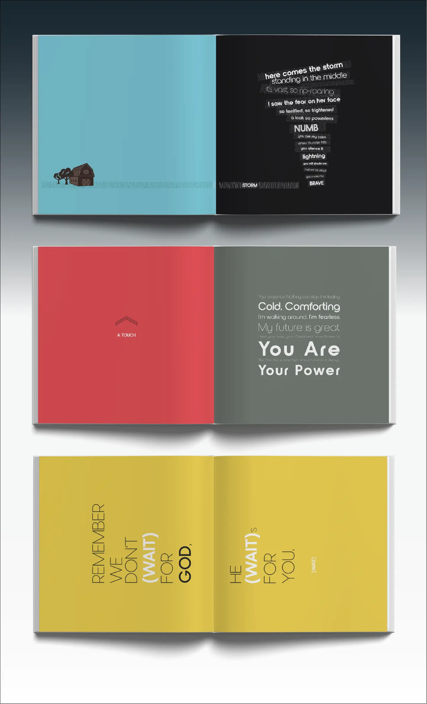
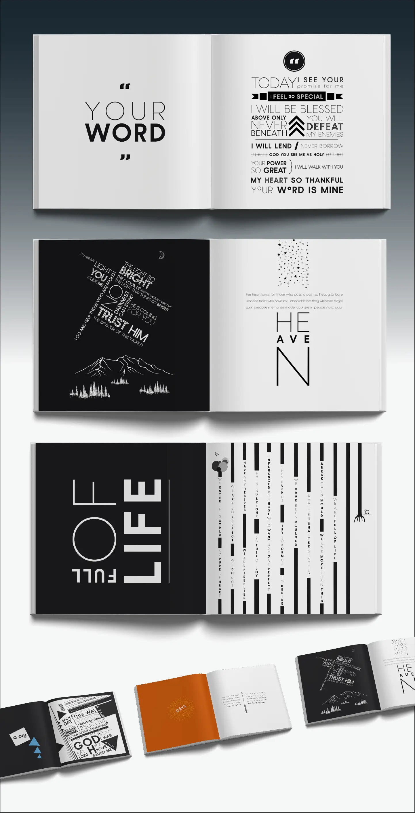
Every page was designed with the intention of bringing the text to life, pairing typography, colours, illustrations, and layout elements in harmony with the rhythm and meaning of the words on the page.This year-long journey demanded a thoughtful and meticulous approach.
Some pages required delicate minimalism, while others flourished with bold compositions that mirrored the intensity of the author’s words. The result is a book where poetry and design are inseparable, each enhancing the other to create a uniquely immersive experience.
Nordique Pro
Nordique Pro
Nordique Pro
Nordique Pro
Nordique Pro
Nordique Pro was chosen as the primary typographic element for the poetry book because of its elegant balance between modern sophistication and subtle organic charm.
Nordiqur Pro’s clean, geometric structure lends clarity to the text, making each poem easily readable while maintaining a refined aesthetic. At the same time, its soft curves and gentle serifs evoke a sense of warmth and intimacy that complements the emotional depth of the poetry.
Nordique Pro is the perfect choice to visually reflect the author's nuanced expressions and to guide readers through the book with a sense of grace and continuity.


LET’S MAKE A PLAN
Get your free Pixelpunk Project Proposal to learn more about how we can help your business make more business through awesome design.
